Using Oil as An Economic Barometer – Are Oil Prices the Best Measure?

Oil prices have finally moved out of contango and are gradually rising. When oil prices are in contango it means that current prices are lower than future prices, thus incentivizing storage over consumption. In simple terms, an oil curve in contango tells us that consumer demand is weak which is the opposite of what you want to see during a recovery, however, is the move out of contango, with the subsequent rise in the price of oil, really an encouragement as far as the big picture is concerned? And are short term price movements the best indicator to utilize with respect to the oil market?
In this article we seek to uncover some macro trends in the oil market. We will also introduce a new tool to better understand what the oil market is trying to tell us.
The data for this article can be found in the following links:
- Oil Price
- Recent Production and Consumption Figures
- Annual Production
- Annual Consumption
- Global Population by Year
What are Increases in the Oil Price Telling Us?
Not very much. When looking for long-term trends it’s important to tune out the noise to focus on the signal. We want to focus on the big picture and not get lost in ephemeral details. Our success as investors depends on it.
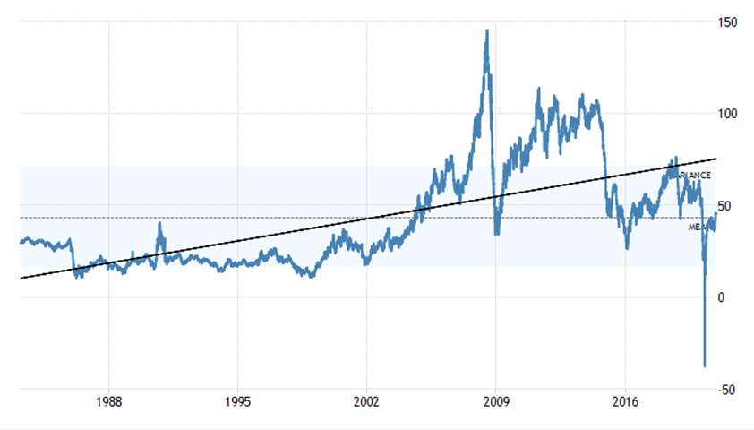
We are told, "the trend is your friend" but what about the below case. On a 30 year chart the trend in oil prices is still higher despite the $0 price this year.
But on the 10 year chart the trend is decidedly negative.
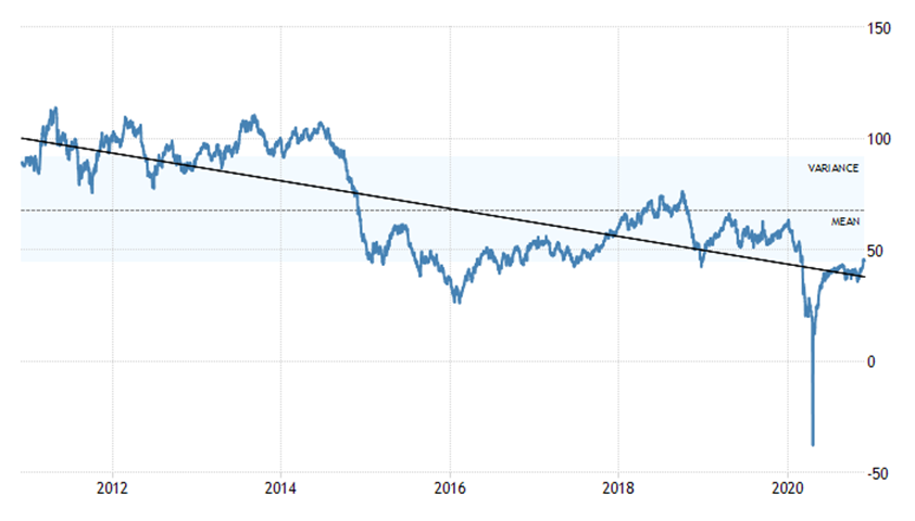
So, which is it? Will the positive trend over the last 30+ years prevail and deliver us back into the hands of prosperity? Or will the trend of the last 10 years continue, taking us on a different, and more difficult, path?
There are many factors to consider when addressing this topic but for the sake of this article in particular we will focus on just a few: oil production, oil consumption, and oil consumption per capita. Please note, our missive uses global annualized data.
Relationship between price and supply
The price of oil is often seen as a general measure of economic health, because it is a measure of how much energy the world is consuming. But price alone doesn't tell the full story. One way to send a positive, and yet false, signal with respect to the the global economic conditions is to decrease the supply.
As we can see in the chart below, oil production has significantly declined in 2020 in response to Covid-19. The figure provided below is valid through the beginning of November 2020, with an estimated annual production for 2020.
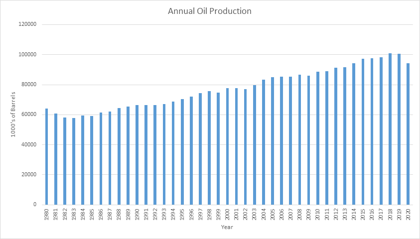
Supply and demand tells us, all else equal, a cut in production will boost the oil price and in 2020 oil production returned to 2014 levels. Since the global economy is supposed to much larger than 2014, we would expect price to be much higher than 2014, but it is half, $100 per barrel in 2014 compared to $50 today.
This years final production number will not be known until next year, but we do know OPEC has made a record sized production cut earlier this year. This tells us something about oil producers expectations for the future; they are forecasting for yet further declines in demand which is the topic we will be covering next.
Global oil consumption
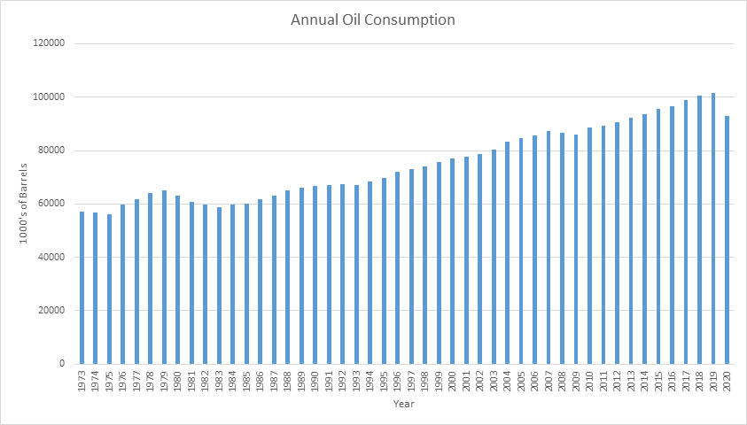
Of the three charts covered up until this point, the oil consumption chart below, is the most reliable of the three. This is because it is actual consumption and is not as susceptible to being manipulated by additional factors.
Like above, consumption has fallen dramatically, returning to 2013 levels. The decrease over the last year has been enormous.
While the consumption chart is the most accurate numbers we have, there is an even better way to measure the economic signals coming from the oil market; calculating oil consumption on a per capita basis. That will provide us with the most accurate picture of what the oil market is telling us.
Oil consumption per capita
The best metric to use to for oil, or any commodity which is consumed in large amounts, is consumption per capita. The way this metric is calculated is by taking the total annual consumption for oil, by number of barrels, for a given year and dividing it by the total global population for that same year. The calculation will provide you with the average consumption per person on a global basis.
By looking only at a rise in absolute oil consumption can be misleading. This is because population over the last few decades as also grown dramatically, so, we would presume a commensurate rise in oil demand, all things being equal, but that doesn’t mean oil demand is actually rising in any significant sense.
If the demand for oil is increasing at a slower rate than the rate of population growth, then demand is actually decreasing or perhaps economic activity per person is decreasing. By calculating oil consumption on an annual per capita basis, we get a clearer picture of what oil demand looks like as illustrated in the chart below.
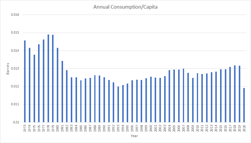
Oil consumption on a per capita basis is at its lowest level in at least half a century.
We can clearly see the 2008-2009 Great Financial Crisis, and since 2010 oil consumption per capita increased to 2019, before plummeting in 2020.
There are many possible factors we could come up with to explain some of lower energy consumption per capita, each taking up a whole blog post on their own. We will only mention one here that people might immediately think of, electric vehicles. Perhaps there is a broad shift away from gasoline to electric vehicles? Tesla is by far the largest producer of electric vehicles, and they consist of a tiny fraction of newly produced cars in recent years. Any move to EVs is a very recent phenomenon and not explain the current dip in consumption or the data prior to 2010.
Just to reiterate, even though demand for oil could be increasing overall, it is going in the opposite direction once we account for population growth.
What is ahead for oil?
The reason the price of oil has been increasing since the April crash probably has less to do with a return of demand and more to do with other externalities such as: production cuts and artificially buoyed demand, through PPP loans, rent and loan deferrals, stimulus, unemployment insurance, etc.
In essence, enormous government interventions into the global economy are masking the void created by bearish trends in demand. What happens when these artificial streams of money expire? That is a question for another article but an important question nonetheless.
If we look back at our consumption per capita chart above, what stands out is the fact that consumption per capita never recovered after the 1970’s. In fact, it has remained mostly flat since that period of time. Since the 1970’s, the chart shows gradual increases in consumption per capita during two important periods of time: 1993 - 2008 and 2010 - 2020, both noteworthy periods of time due to the presence of enormous credit bubbles. If the credit conditions had been tighter during these periods would we have seen consumption per capita rise? We can never know for certain but it is doubtful.
There are many other data points to observe and consider when analyzing such a complex commodity as oil, however, the main objective of this article was to show that there is a better way to analyze the oil market than simply looking at the price. Hopefully this discussion encourages the reader to continue to learn more.
Enjoying these posts? Subscribe for more
Subscribe nowAlready have an account? Sign in